


Choosing the Right Colour Scheme for Your Website
5th July 2021
When choosing the colour scheme for your website, there are many factors to consider. You must maintain a consistent theme across your online presence, and the colour palette you decide upon needs to compliment your branding – including company logo and font choices.
You want a cohesive and coherent visual across the board in order to develop your brand identity. This will allow your customers to form an association with your business and ensure brand recognition.
The importance of colour
Colours play an important role in how businesses are perceived by their audience. They influence mood and provoke certain actions and reactions. Each colour tends to have both positive and negative connotations.
Red, for example, is commonly associated with danger, as well as passion and love. Yellow represents happiness and positivity, but also cowardice.
It is because of these associations, and the power of colour to provoke emotional and physical responses, that choosing the correct colour palette for your website is an important decision.
Keep it relevant
Your chosen colour scheme will be a deciding factor in the effectiveness of your website, so it’s important to get it right.
You need to tailor your site's colour scheme to your target audience and be sure to make it relevant to the products or services you provide. You don’t want to base the design on your personal favourite colours. To help you decide on the right colour scheme for your business website, we have provided some useful information to consider below.
Common colour associations
Certain colours elicit particular reactions. Knowing the common emotional responses derived from colours will benefit your business. So here are a few of the most used colours and the common associations.
1. Red
Red is a bold, confident colour that elicits a variety of emotions ranging from fear and anger to excitement and passion. In website terms, it’s best to use red sparingly. Red is effective when used to promote a sale or highlight information that is of high importance.
2. Yellow
Yellow is associated with happiness, positivity and optimism. It’s a bright colour that emits freshness and warmth. Though in contrast, yellow is also associated with cowardice. It is a useful colour to use when creating a call-to-action on your site.
3. Blue
Blue represents intelligence, trustworthiness and strength. It can be effective when used as the primary colour on your website. The lighter shades promote relaxation and serenity, whilst the darker blues portray authority and knowledge.
4. Green
Green is a peaceful, earthy colour that works well in promoting natural and environmentally friendly products. On the flip side, green has connections with jealousy and envy. However, the positive perceptions of green are much more commonly identified with.
5. Orange
Orange is a youthful, vibrant, happy colour that displays confidence and enthusiasm. It is a fun colour, but can also represent instability. Orange is also a great colour to use in a call-to-action.
6. Purple
Purple is used to convey wisdom, regality and intelligence. It is a warm, soothing colour and is often used in promoting beauty products.
7 Black
Black is a commonly used shade in web design. It’s simple but effective, creating a sense of confidence, class and importance. Black works well with so many other colours that it is a reliable choice for website design.
8. White
White has connotations of purity and innocence. It’s a fresh, welcoming colour and (like black) it works well with almost every other colour. It’s often used as the primary background colour on web pages.
The above colours are commonly used in web design, but are merely the tip of the iceberg when it comes to colour options. Read this article for a more in-depth look at colour psychology.
Age and gender
When choosing your colour scheme, consider your target demographic. What is their gender? How old are they? These factors will figure in your decisions.
Studies have shown that colour preferences change as we age and differ in men and women.
Seniors aged 55 and over tend to prefer softer pastel shades, whereas teenagers opt for darker, bolder colours such as red, black and blue.
Studies show that both men and women are drawn to blue, green and red, but there’s a stark difference in opinion when it comes to purple and, to a lesser extent, yellow.
On this basis, if your business predominately caters for women, purple is a viable option for your website. However, you may want to avoid it if the bulk of your audience is male.
Keep it simple
Be sure to limit the number of colours included in your web design. The optimal number is three – maximum four. Any more and you risk overcomplicating the page, which can affect user experience.
Your dominant colour should make up around 60% of your site. 30% should be given to your secondary shade, with the remaining 10% saved for your accent colour.
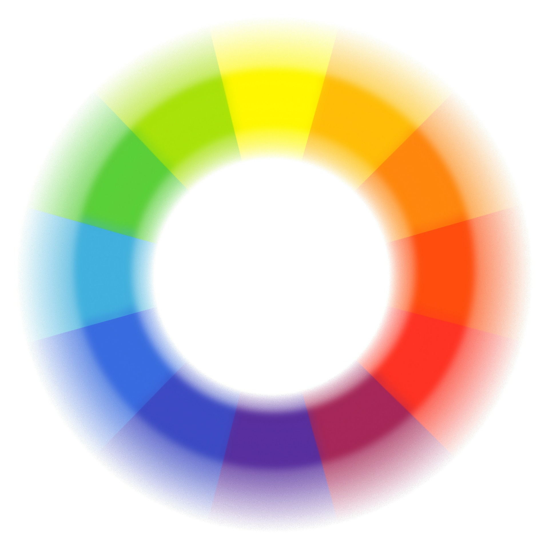
Be sure to use contrasting yet complementary colours to ensure optimum impact. If you are unsure as to which colours contrast and complement each other, the colour wheel can be a useful tool.
Know your competition
Your website's colour scheme should be unique to your company. If your main competitor uses blue as their primary shade, then you should avoid this colour as much as possible – using a lighter/darker shade of blue or gradient colours to differentiate if necessary.
Also consider whether your chosen colours are connected to active political parties or movements. Depending on the association, this could work in your favour or go against your company image.
This year's tone
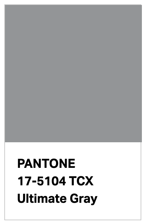
If you are looking for your site to be on-trend and modern, you will be interested to know this year's Pantone Color of the Year (PANTONE 17-5104 Ultimate Gray + PANTONE 13-0647 Illuminating).
As quoted on pantone.com: “For over 20 years, Pantone’s Color of the Year has influenced product development and purchasing decisions in multiple industries, including fashion, home furnishings, and industrial design, as well as product packaging and graphic design…”
If this combination is currently proving effective in marketing campaigns, you may benefit from using it within your website.
Pantone colours will need to be converted to Hexidecimal codes for use on your website. We can help you with that.
Key takeaways
In this post we have established the importance of choosing the right colours and what to consider when deciding on your website’s colour scheme.
To summarise the main points:
Be consistent with your branding and company identity
Consider common associations and connotations
Don’t copy your main competitors
Consider your target demographic
Use contrasting colours (maximum of four)
Need Help?
At it'seeze Website Design, you're never alone. If you want help updating your website, let's arrange a website review. We can make content suggestions, provide training, and help make sure that your website never gets stagnant.
If you’re looking for a professional web design company that has knowledge of colour theory and will design a website that will fit your brand perfectly, then contact the it’seeze Stevenage team today to discuss your project.
Just contact us to get the ball rolling.
Share this post: