


What You Need to Know When Choosing Website Fonts
6th September 2021
Building a professional website for your business requires a number of creative elements to work together cohesively: impactful design, compelling copy, engaging images and the perfect font to compliment the content.
The font type used on your site might not seem like an important decision, but using the wrong font can have an adverse effect on user experience.
When your site is full of quality images and well-written copy, you don’t want it let down by an unappealing font. The fonts used on your website should complement the other design elements – Even the greatest of copy will fall flat if it’s not readable.
This can mean that your favourite font is not actually the one you should use for your site. Fonts have a job to do – they’re not purely decorative – and the right font for the job is one that resembles the products and services your business provides.
It’s important to choose your website’s fonts carefully, so to aid you in your choice, we have listed below our top tips for picking the best fonts for your website.
Setting the tone
It’s not what you say, it’s how you say it, and your chosen font will say a lot about your business.
If you are running a 4-star hotel in an upmarket location, then you may opt for an elegant page title in a flowing, cursive font. A venue such as this would not be best served using large, bright cartoon letters for an important call-to-action.
Your chosen font should complement, not clash with your company image. It is a wasted effort to craft the perfect copy and then present it in a font that contradicts your brand’s intended tone.
Therefore, the first step in choosing the correct font is to identify your target audience and how you want them to perceive your business. Thinking about what your business is selling and who it is selling to will assist you in picking the correct font to engage your target audience.
If your target demographic consists of people of pension age and over, then a simple, larger font may be best suited. Whilst a younger audience may respond more positively to modern, less formal designs.
The intention of the copy should also be considered. For example, if you are looking to build excitement for a sale, you will opt for large, bold letters.
Font classification
The main categories of font style are serif, sans serif, and script fonts. Each of these have particular strengths, and being aware of the best places to use each of them will assist decisions on which is right for your website.
1. Serif

Serif fonts are the most formal and are commonly used in books and newspapers.
The font style derives its name from the ‘serif’ lines stretching from each letter. These are classic, elegant fonts that are often used to appeal to an older demographic.
Examples of popular serif fonts are Times New Roman and Georgia.
2. Sans serif

Sans serif are fonts without serif lines, making them much easier to read on websites. This makes sans serif the most popular choice for use in web design.
Popular sans serif fonts include Helvetica, Ariel, and Futura.
3. Script

Script fonts resemble handwriting, and are perfect for elegant headlines, but can make reading large bodies of text a challenge – so use sparingly.
Some popular script fonts include Lobster and Reklame Script.
Text formatting
On your website, you will want to maintain some sense of uniformity, so it’s good to use variations of the same font class for different sections of your web pages.
To establish cohesion, a heading can be emphasised using italics, underlining or bold type, rather than an entirely different font.
3. Design
First impressions count, and an unappealing font style can count against you.
This is not a case of personal preference - you need to prioritise practicality. You want to capture and hold a reader's attention, and a font that is challenging to read will turn visitors away.

Your font choice may vary depending on the purpose of the text – whether a heading, subheading, body text or call-to-action.
Your header can stand out in a more decorative font, while the main body of text will benefit from a simpler style for better readability.
The font should be relevant to the intended function of the words. The role of a heading differs from that of the main text, so the style choices of each should highlight this.
A call to action needs to be prominent in order to be effective, so a larger font will work better.
Font size
Font size is another crucial element to consider, taking into account that the size will alter slightly depending on the device it is viewed on. Consider the devices that your target audience are likely to be using and select a suitable font for this medium.
Remember though, that your fonts need to be readable, regardless of the device that your site is being accessed on.
Website fonts dos and don'ts
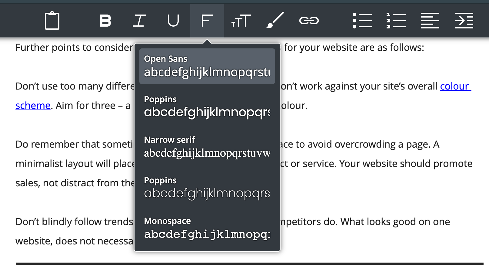
Further points to consider when choosing the perfect fonts for your website are as follows:
Don’t use too many different colours and make sure they don’t work against your site’s overall colour scheme. Aim for three – a primary, secondary, and accent colour.
Do remember that sometimes less is more. Allow white space to avoid overcrowding a page. A minimalist layout will place greater emphasis on the product or service. Your website should promote sales, not distract from them.
Don’t blindly follow trends and use a font because your competitors do. What looks good on one website, does not necessarily suit all.

Fonts in professional web design
So, there it is – everything you need to know to choose the right fonts for your website.
But if you’re still unsure as to which fonts will work best for you, chat with a member of our team. We'll be be happy to discuss font options.
Here at it'seeze Stevenage, our expert design team will be more than happy to source the most effective fonts for your business when designing your website. Be sure to check out our design portfolio and see the variety of fonts used throughout our designs.
Get in touch with our friendly team to learn more about our professional web design services and how we can get your business ahead online.
Please note: We use google fonts by default in our designs. Clients can choose their own from fonts.google.com. We are happy to use a non-google font, but the cost of the font license will have to be paid for separately.
Final note
Lastly, a note on terminology – we’ve referred exclusively to website fonts throughout this guide, but you may come across the term typeface when searching online for fonts.
Traditionally, typeface was used to describe a particular design, such as Times New Roman or Helvetica, whilst font was used to describe the different weights, styles, and sizes that make up a typeface, e.g., Times New Roman, size 12, bold.
The rise of digital media has seen the two terms become increasingly synonymous. Font and typeface are now used interchangeably to describe the style of text used within websites and computer programs.
In the interest of simplicity, it’s widely accepted that everything text-based is referred to as the font. This is the most commonly used term amongst the general public.
Need Help?
At it'seeze Website Design, you're never alone. If you want help updating your website, let's arrange a website review. We can make content suggestions, provide training, and help make sure that your website never gets stagnant.
Just contact us to get the ball rolling.
Share this post: